Upload date
All time
Last hour
Today
This week
This month
This year
Type
All
Video
Channel
Playlist
Movie
Duration
Short (< 4 minutes)
Medium (4-20 minutes)
Long (> 20 minutes)
Sort by
Relevance
Rating
View count
Features
HD
Subtitles/CC
Creative Commons
3D
Live
4K
360°
VR180
HDR
5,446 results
Excel is one of the most used skills in the data world. In this series we will be walking through all of the most important topics that ...
225,591 views
4 years ago
How to visualize data through 3D Map on MS-Excel has been shown throughout the video.
22 views
2 years ago
... IBM Data Analysis Specialization - https://coursera.pxf.io/AoYOdR Tableau Data Visualization - https://coursera.pxf.io/MXYqaN ...
16,017 views
4 weeks ago
Take my Full Excel for Data Analytics Course! https://www.analystbuilder.com/courses/excel-for-data-analytics Excel is one of the ...
1,269,790 views
17,843 views
1 year ago
Doughnut Chart in Excel | Create Interactive Doughnut Chart | How to Create a Doughnut Chart in Excel b In Ms excel you can ...
42 views
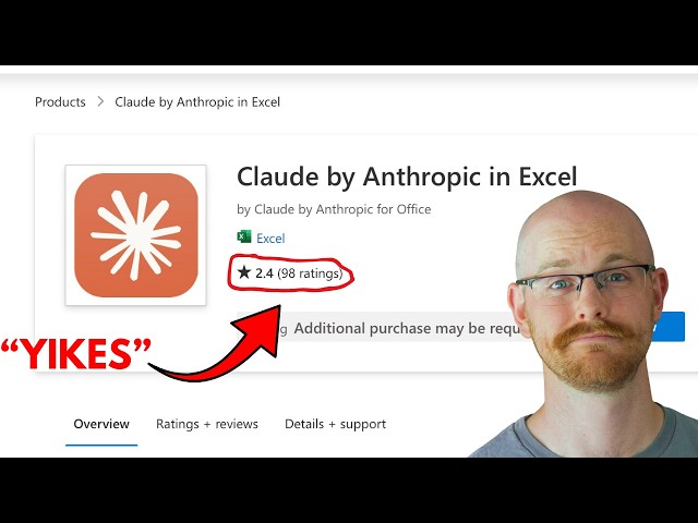
This week I say what everyone is thinking... To be clear, I still think Excel is actually really good for a lot of things, but the more I ...
26,638 views
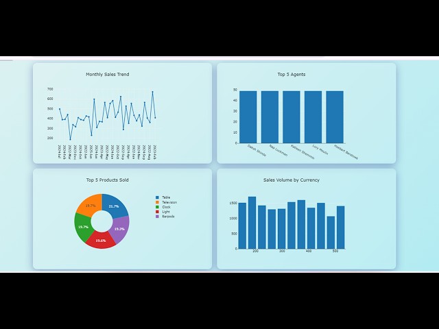
In Ms excel you can Interactive Dashboard in Ms Excel | Data Visualization in Ms Excel | Create Dashboard in Excel Ease, we ...
127 views
Check out my Full Tableau Course Here: https://www.analystbuilder.com/courses/tableau-for-data-visualization This is our first of ...
993,053 views
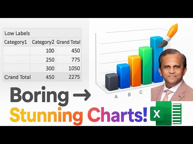
exceldashboardstutorial #excelskills #excelforbeginners Prompt 1 This is the structure of my sales data in JSON format.
499 views
Power Map in Excel | Data Visualization with Excel Maps | How to Use 3D Map in Excel, you have the opportunity to captivate your ...
218 views
Presented by David Christensen. This video is part of a series of lectures recorded to teach about basic data visualization ...
317 views
9,365 views
My Courses on Linkedin Learning: https://www.linkedin.com/learning/instructors/tim-ngwena My Courses on Linkedin Learning: ...
10,487 views
This video explains how to make 7 basic visualisations in excel - bar chart, column chart, line chart, histogram, pie chart, doughnut ...
115 views
382,104 views
10,223 views
Welcome to Analytics Advisors – your comprehensive learning hub for mastering data analytics, data visualization, and business ...
16,573 views
5 months ago
My Microsoft Excel Playlist: https://www.youtube.com/playlist?list=PLHrw3fxxgFBRyH308kfvRZnAIevkaKkf0 Join Whatsapp group: ...
13,408 views
2 months ago
This video covers basics of working with big data in excel including: Split Panes, GoTo, shift vs. control for selecting cells, and ...
3,127 views
11 years ago