Upload date
All time
Last hour
Today
This week
This month
This year
Type
All
Video
Channel
Playlist
Movie
Duration
Short (< 4 minutes)
Medium (4-20 minutes)
Long (> 20 minutes)
Sort by
Relevance
Rating
View count
Features
HD
Subtitles/CC
Creative Commons
3D
Live
4K
360°
VR180
HDR
4,839 results
Did you know you can use the pandas Python library inside Microsoft Excel to conduct advanced statistical modeling? Watch here ...
51,180 views
2 years ago
Excel Waterfall Chart: Beginner's Guide Learn how to create a waterfall chart in Excel with this beginner's guide! Waterfall charts ...
56,260 views
1 year ago
In Excel Excel Column Cells add Charts | Data Visualization - Data with Chart in Excel #shorts Learning #Charts #ColumnChart ...
33 views
3 years ago
Chart Template for Plan vs Actual Comparisons: Showcase Simple IBCS-Style Chart Template ...
2,416 views
Want to make your Excel spreadsheets more dynamic? Learn how to create Progress Bars to track goals, deadlines, or tasks ...
451 views
... Doughnut chart in Excel - How to make 2D-3D charts in Excel #Shorts #PieChart #DoughnutChart in ms excel data visualization ...
215 views
In this video, I'm sharing my very first data analysis project using SQL, Excel, and Tableau. Discover the steps I took, the lessons I ...
70 views
Support Me & More: linktr.ee/benthompsonuk In this video, we will show you why it's time to say goodbye to filters and embrace ...
2,438 views
In the realm of Excel's powerful features lies a tool that transforms raw data into insightful visual representations - Charts. When it ...
58 views
Learn the top ways to make money online in your free time in 2024! Discover how you can start freelancing on platforms like ...
9,194 views
Simple Combo chart in Excel for data visualization #shorts #1million hey everyone! In this video, I'll show you how to make ...
66 views
This visualisation shows one of the ways by which data from the Wait Advisor app can be presented: a heatmap as a function of ...
98 views
7 years ago
Learn how to create stunning diagrams in Microsoft Excel effortlessly! In this quick tutorial, we'll show you a step-by-step method ...
67 views
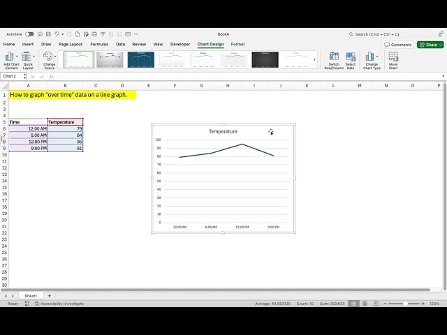
How to graph "over time" data on a line graph using Microsoft Excel. #AdamsAnalytics #DataOnDemand #Analytics.
46 views
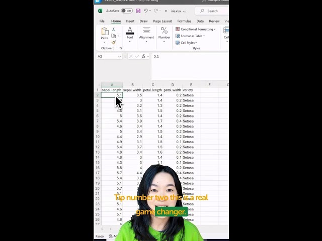
You can now visualize your data using Python in Excel! + = Watch here as Anaconda's Sophia Yang walks through three ...
24,205 views
In this video I demonstrate how to create a scatterplot in Microsoft Excel 365.
735 views
6 years ago
#exceldashboard #ChatGPT #ExcelTips #ExcelAutomation #DataVisualization #MicrosoftExcel #ProductivityHacks #AIInExcel ...
521 views
Excel Chart Cleaning Tips Effective data visualization is crucial for conveying information. While Excel ...
141 views
ChatGPT is revolutionizing the way we work with data. This video will demonstrate how to leverage its power to transform complex ...
40 views
Simplify Your Data Analysis in Excel with Predefined Datasets , Charts, Correlation, Pivot Table #shorts #ytshorts #excel ...
111 views