Upload date
All time
Last hour
Today
This week
This month
This year
Type
All
Video
Channel
Playlist
Movie
Duration
Short (< 4 minutes)
Medium (4-20 minutes)
Long (> 20 minutes)
Sort by
Relevance
Rating
View count
Features
HD
Subtitles/CC
Creative Commons
3D
Live
4K
360°
VR180
HDR
1,986 results
Choosing the best visualization for your data is not always the easiest. Here are 5 tips on what charts to use and when ...
669 views
11 months ago
This is CS50, Harvard University's introduction to the intellectual enterprises of computer science and the art of programming.
60,628 views
1 year ago
Katie Ledecky may just be the GOAT. We explain why the 1500m race is so brutal and how dominant Katie really is.
1,202 views
https://www.anapaintsllc.com/physics-research-fellow-auc-data-science-initiative.
10 views
7 months ago
... data analytics project, Power BI tutorial, Power BI beginner project, sales dashboard Power BI, Power BI data visualization, cafe ...
1,047 views
3 months ago
#graphmaker #datavisualization #slidedeck #powerpoint #presentation #consulting #sales #marketing #analyticsreport.
287 views
Try Julius AI - Your Personal Data Analyst: ✓ from Forecasting ✓ to generating Visualisations ✓ or training Neural Networks ✓ or ...
12,388 views
2 years ago
... charts, analytics reporting and it makes my data look SO good. #dataanalytics #datavisualization #dataviz #infographics #graph ...
967 views
ProMind AI let's you plot graphs and various other visualisations for your data.
561 views
Watch this dynamic data visualization track the Top 10 most subscribed channels in the world from 2015 all the way to 2025.
44 views
1 month ago
Using Excel to combine two datasets and perform data visualization.
6 views
831 views
Taking a look at what's next for the next year now that the Olympics are over. Top 4 U.S. Men's sports are reflected here, but we ...
1,064 views
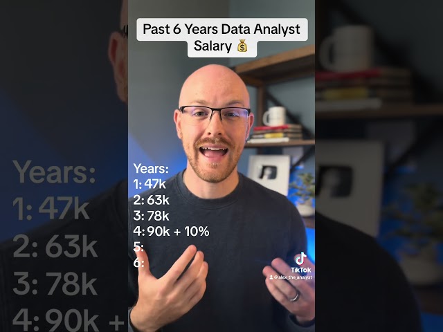
Right so let's go through my salaries over the past six years as a data analyst my very first job as a data analyst was that a ...
57,681 views
... the two person different here and the answer is very simple It's called data visualization It is the art of understanding your data in ...
11 views
2 views
Data presentation and result, how a qualitative data analysis job looks like.at a glance. final output after analyzing using Atlas to ...
4,840 views
1,273 views
... Python data analysis tutorial Python data analysis projects End-to-end data analysis with Python Python data visualization ...
863 views
These are my 4 tips to visualise your data that I learned on the the way...
697 views
3 years ago