Upload date
All time
Last hour
Today
This week
This month
This year
Type
All
Video
Channel
Playlist
Movie
Duration
Short (< 4 minutes)
Medium (4-20 minutes)
Long (> 20 minutes)
Sort by
Relevance
Rating
View count
Features
HD
Subtitles/CC
Creative Commons
3D
Live
4K
360°
VR180
HDR
1,505 results
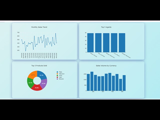
This video demonstrates how to: 1 Show Dashboard; 2 Export to Excel. https://stimulsoft.com.
747 views
7 years ago
exceldashboardstutorial #excelskills #excelforbeginners Prompt 1 This is the structure of my sales data in JSON format.
499 views
1 year ago
In this video of #engineeringmanagementacademy #pivottable is tutored in an #ExcelProject by #DrMehrdadArashpour ❎ Excel ...
427 views
Animate Project Delay Analysis in Excel! This video, explained by Dr. Mehrdad Arashpour, implements Pareto Front Optimization ...
1,372 views
How to Create a Waterfall Chart in Excel (in Excel 2016 or newer) | How to Learn Excel In this video, we'll walk through creating a ...
1,751 views
Presented by David Christensen. This video is part of a series of lectures recorded to teach about basic data visualization ...
317 views
4 years ago
Raw dump is creating in better visualization which helps for better good business decision here is quick tip insert chart switch row ...
40 views
This video covers basics of working with big data in excel including: Split Panes, GoTo, shift vs. control for selecting cells, and ...
3,127 views
11 years ago
Join this channel to get access to perks: https://www.youtube.com/channel/UC4C_tfy6WLDxzVVO3y6YinA/join This is my ...
2 years ago
Analyse and visualise your data in spreadsheets using natural language english with Clevrr Sheets. Create beautiful dashboards ...
115 views
In this video of #engineeringmanagementacademy #sparklines are tutored for #communication_management by ...
196 views
Using https://infranodus.com you can visualize the content of any CSV spreadsheet as a knowledge graph, so you can see the ...
2,568 views
Excel Charts 101: Best Practices for Clean and Effective Charts In this tutorial, you will learn: How to properly organize your data ...
312 views
The data visualiser application allows the user to generate various charts directly within DHIS2. The Data Visualiser tool follows ...
10,247 views
Gantt Diagrams for Agile Project Management in developing a minimum viable product! This step-by-step tutorial by Dr. Mehrdad ...
2,359 views
Learn powerful AI - artificial intelligence - features built into Excel (Office 365 Pro Plus) and Power BI Desktop - which is free to use ...
10,904 views
5 years ago
In this video of #engineeringmanagementacademy #LinearRegression is tutored in an #excelproject by #drmehrdadarashpour ...
623 views
Welcome test reporting quickly episode and this episode will be looking at data visualization so today's quickly will be sticking to ...
168 views
This video demonstrates how to: 1 Preview Dashboard; 2 Export dashboard with all items to Microsoft Excel. https://stimulsoft.com.
1,520 views
In this 1 hour Webinar, Dr. Nitin Paranjape (Office MVP) will show you how to structure and analyze large amount of data in just a ...
17,371 views
10 years ago
![Interactive Dashboard: Export Dashboard to Excel (Only Items) [Shot on v2018]](/api/proxy/image?url=https%3A%2F%2Fi.ytimg.com%2Fvi%2FWjqTsGIpCdI%2Fsddefault.jpg)


![Interactive Excel Dashboard: Export to Excel [Shot on v2018]](/api/proxy/image?url=https%3A%2F%2Fi.ytimg.com%2Fvi%2FzHmZhGAQhMk%2Fsddefault.jpg)